ATLAS—FORM is a contemporary architecture studio website concept for a London-based practice. Built in Webflow, the project combines Swiss-inspired typography, editorial layouts, and a minimalist visual system to communicate architectural work with clarity and confidence.

Duration
1 Week
Scope
Webflow Development
Tags
Figma to Webflow · GSAP · Architecture · Client-first
Overview
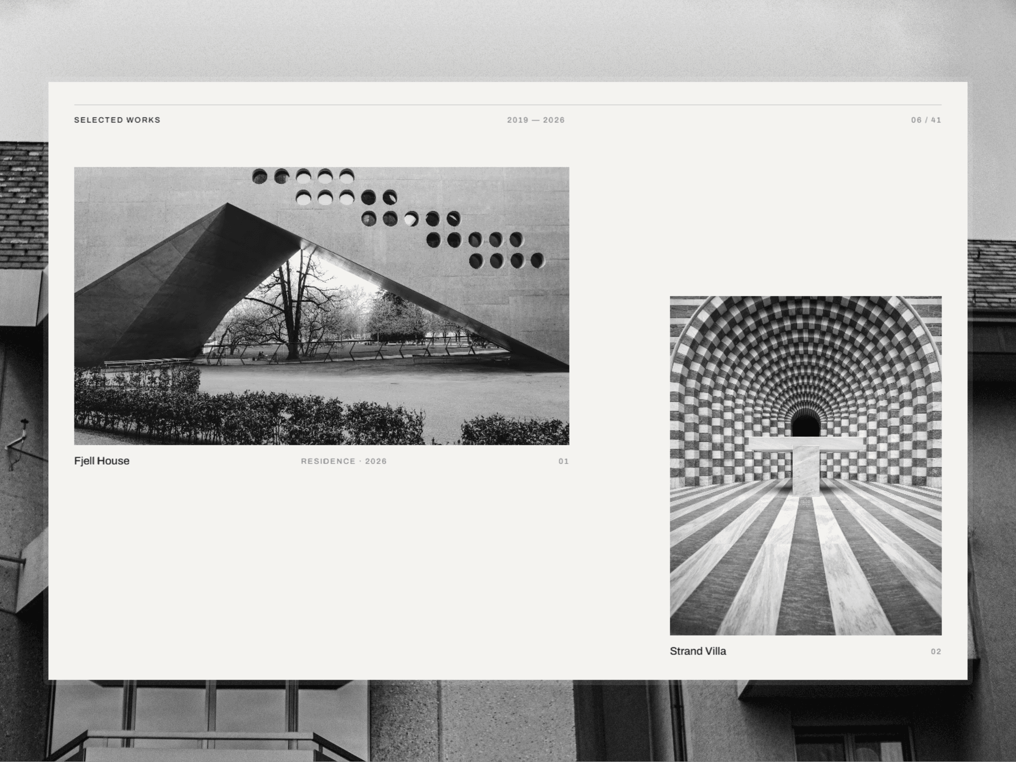
ATLAS—FORM is a conceptual website for a contemporary architecture studio based in London. The project was designed to showcase residential, hospitality, and cultural work through a refined editorial experience that reflects the discipline and precision of modern architecture.
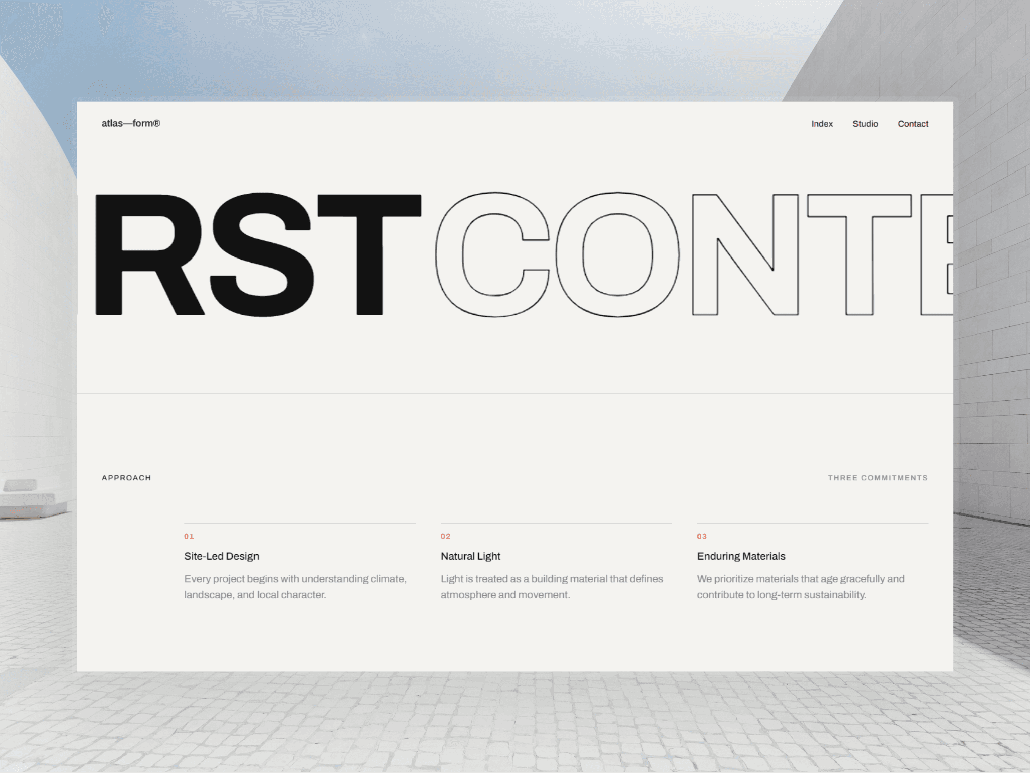
Inspired by Swiss modernist principles, the website relies on oversized typography, asymmetric compositions, and a restrained color palette to create a strong visual identity. The goal was to build a premium digital experience where structure, hierarchy, and content become the primary design elements.
The entire project was developed in Webflow with a scalable design system, responsive layouts, and clean architecture that supports future growth and content expansion.
The Challenge
Architecture studios often struggle to present their work online without overwhelming visitors with excessive visuals, animations, or unnecessary interface elements.
For ATLAS—FORM, the challenge was to create a website that felt sophisticated and memorable while maintaining the simplicity and restraint commonly found in contemporary architectural design.
Key challenges included:
Translating a highly editorial design direction into a responsive Webflow build
Preserving intentional asymmetry across all screen sizes
Maintaining readability with oversized typography
Creating strong visual impact without relying on decorative UI patterns
Building a scalable structure that remains easy to maintain and update
The Approach
The solution focused on creating a typography-led experience that mirrors the principles of architectural design itself: structure, balance, and precision.
Editorial Design System
A minimal design language was established using a limited color palette, consistent spacing, and carefully defined typography styles to create visual rhythm throughout the site.
Responsive Architecture
Every layout was optimized across desktop, tablet, and mobile breakpoints while preserving the intended composition and hierarchy of the original design.
Scalable Webflow Development
The project was built using reusable components, global variables, and organized class structures to ensure long-term maintainability and flexibility.
Performance & Simplicity
Rather than relying on heavy interactions, the experience focuses on typography, spacing, and content presentation, resulting in a lightweight and highly performant website.
The Results
ATLAS—FORM successfully demonstrates how a minimalist approach can create a distinctive and premium digital presence for an architecture studio.
The final result delivers:
A strong editorial visual identity
Fully responsive layouts across all devices
A scalable and maintainable Webflow build
Improved content hierarchy and readability
A premium brand experience aligned with contemporary architecture practices