Atlas—form, an architecture studio website built in Webflow.
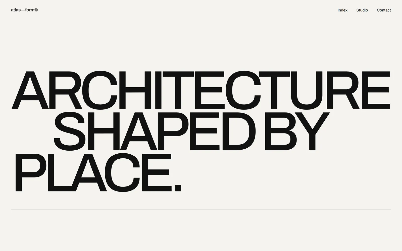
An editorial concept for a London architecture practice, built on oversized Swiss type, asymmetric layouts and a restrained palette that holds together on every screen.
Overview
An architecture studio site where type and structure do the work.
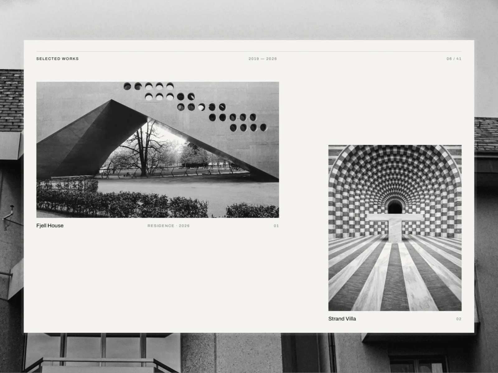
Atlas—form is a self-initiated concept for a contemporary architecture studio in London. It presents residential, hospitality and cultural projects in an editorial layout that reflects the precision of the work.
The design draws on Swiss modernism: oversized type, asymmetric compositions and a restrained palette. Structure, hierarchy and content carry the identity, with almost no decoration.
I built it in Webflow from the Figma file, with a scalable design system and responsive layouts, so new projects and pages can be added without breaking the grid.
- Type
- Studio website
- Scope
- Webflow development
- Built with
- Figma to Webflow, GSAP, Client-First
- Timeline
- 1 week
- Live site
- atlas--form.webflow.io
Challenge
Keep an editorial layout intact on every screen.
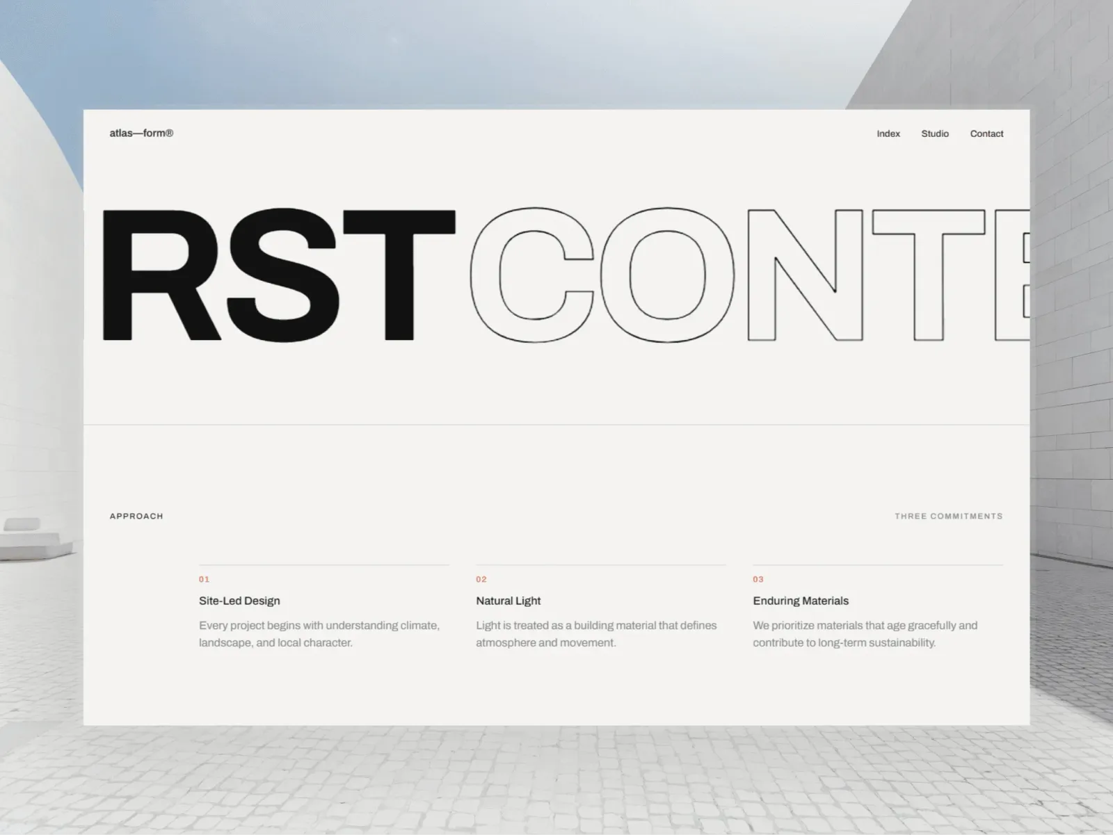
Architecture sites often bury the work under heavy visuals, animation and interface. Atlas—form had to feel premium and memorable while staying as restrained as the buildings it shows. The hard parts were:
- Translating a highly editorial Figma design into a responsive Webflow build
- Keeping the intentional asymmetry on tablet and mobile
- Keeping oversized headlines readable at every width
- Creating impact without decorative UI patterns
- Leaving a structure that stays easy to maintain and update
Approach
A type-led build that mirrors the architecture.
I treated the site like the buildings it presents: structure first, then balance and precision in every detail.
Editorial design system
A limited palette, consistent spacing and a defined set of type styles give every page the same visual rhythm.
Responsive layouts
Every layout was tuned for desktop, tablet and mobile while keeping the composition and hierarchy of the original design.
Scalable Webflow structure
Reusable components, global variables and Client-First class names keep the build easy to maintain and extend.
Speed through restraint
The experience relies on type, spacing and content instead of heavy interactions, which keeps the site light and fast.
Result
A premium presence built on restraint.
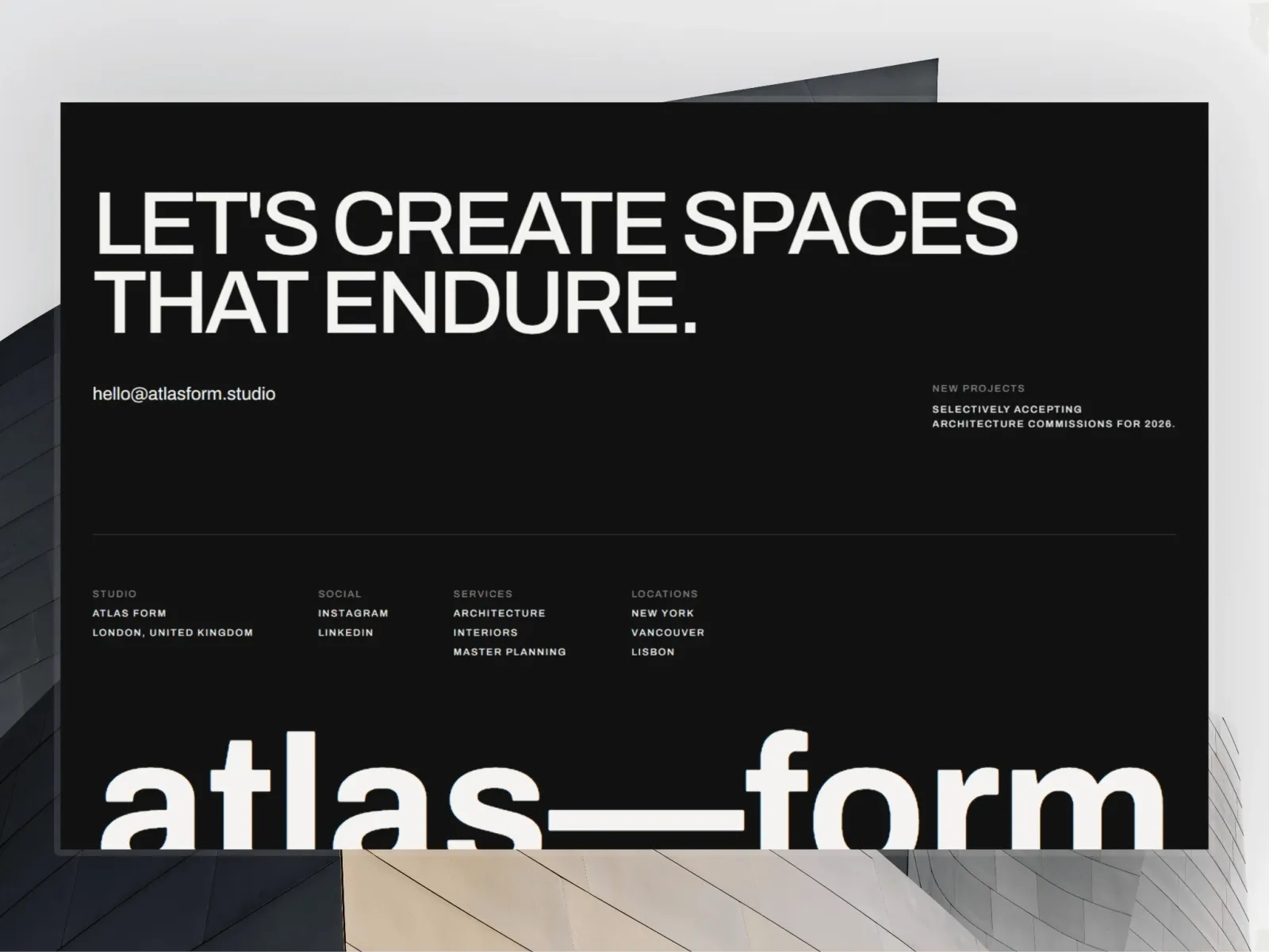
Atlas—form shows how a minimal approach can give an architecture studio a distinctive, premium website. The finished build has:
- A strong editorial identity
- Fully responsive layouts on every device
- A scalable Webflow build that is easy to maintain
- Clear content hierarchy and comfortable reading
- A brand experience in line with contemporary architecture practices
More work
More Webflow projects
Client work and self-initiated concepts, each built from a Figma file with Client-First structure and tested on every screen size.
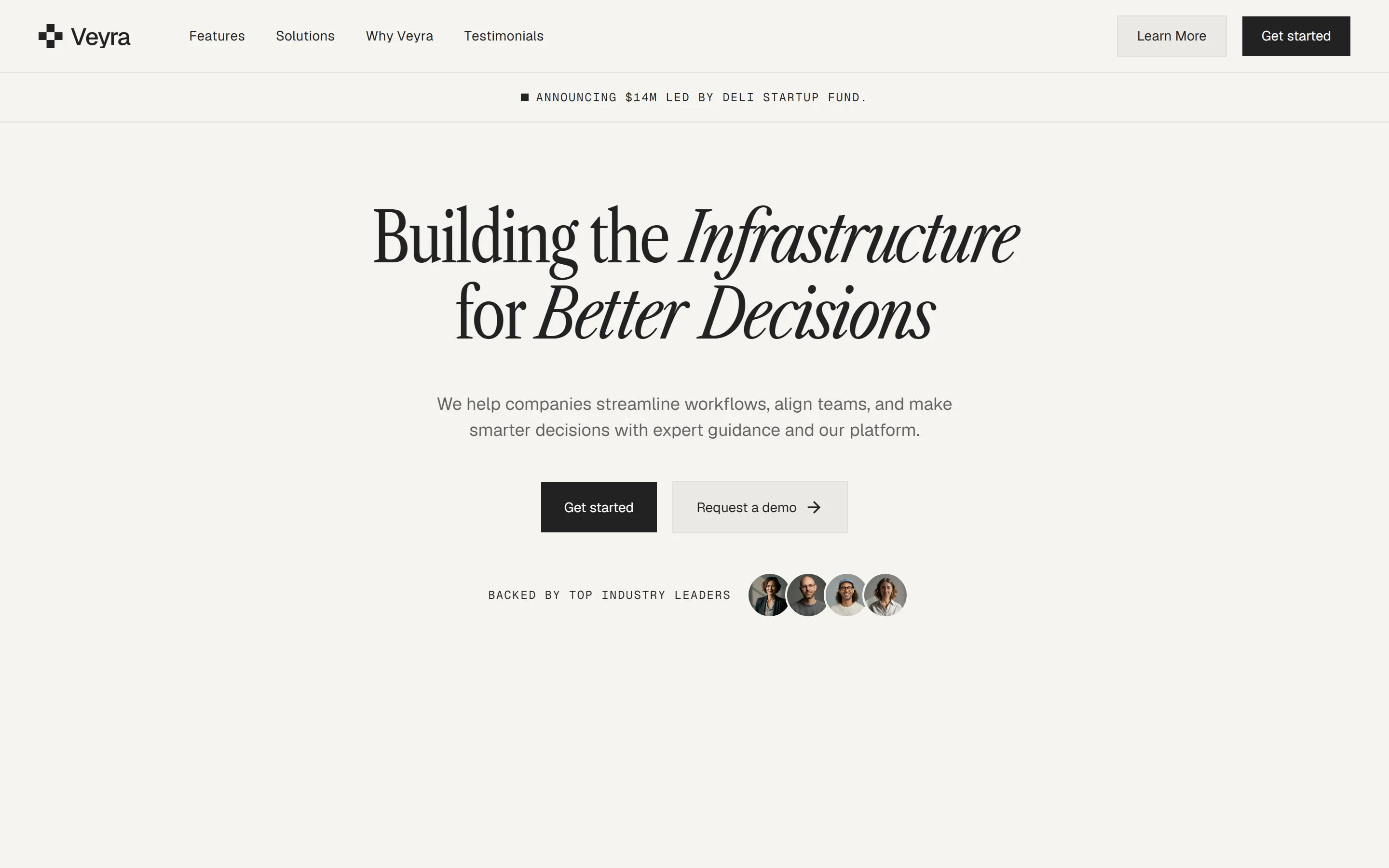
Veyra
AI SaaS landing page · Concept

Boldframe Studio
Creative studio website · Concept